Blend
Overview
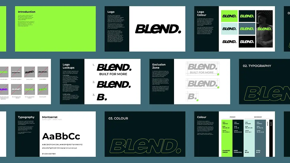
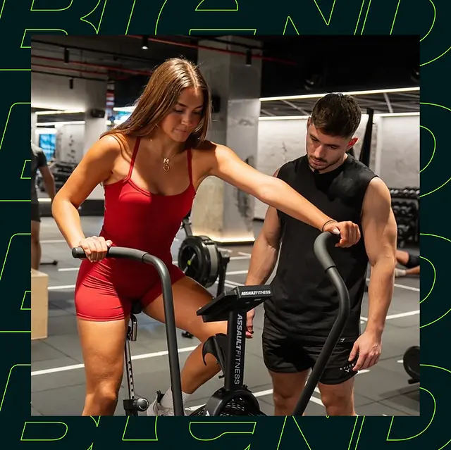
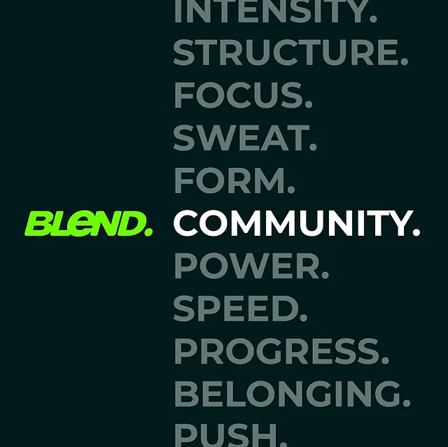
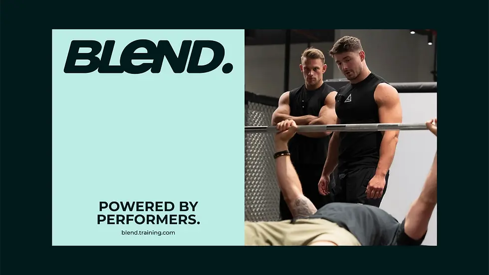
Blend is a structured group training programme combining strength, functional fitness, and performance-based conditioning. Designed for experienced trainers, it brings clarity and structure to those who want to feel good, sharp and perform like athletes without burning out. The tagline “Built for more” reflects a no-nonsense approach to developing strong, athletic humans. Blend needed an identity that felt confident, modern and premium, one that communicated structure, performance and community without relying on hype. Designed to speak to experienced athletes, the brand needed energetic visuals and a bold, performance-led colour palette to convey momentum, focus and balance, while standing apart from the noise of generic fitness branding. The Blend logo is designed to feel bold and inclusive. Its slanted form conveys momentum and forward motion, while curved edges introduces flow and approachability. Layered letterforms highlight unity and the idea of blend, showing how individual elements combine to create something greater. The bold weight communicates confidence and stability, anchoring the design with authority. The lowercase ‘e’ is the focal point. It introduces a human touch, reflecting the balance between community and individuality, a subtle nod to the idea that Blend is built for the group, yet shaped by the unique contribution of each member. The identity is built on a strategic system, where layout, form, and tone work together to bring Blend to life. Every detail is purposeful, reinforcing clarity, confidence, and cohesion across all touchpoints. The result is a brand that feels rigorous yet approachable, unified yet flexible and designed to perform.